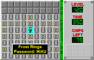
User:Indyindeed/Infobox Test
| Level set | Chip's Challenge Level Pack 2 |
|---|---|
| Designer | Tyrethali Ansrath |
| Level number | 120 |
| Time limit | 350 |
| MS | |
| Password | IKKU |
|---|---|
| Chips required | 79 |
| Chips available | 79 |
| Bold time | 335 |
| Difficulty | ***** |
| Bold difficulty | ***** |
| Bold routing | ***** |
| Lynx LX | |
| Password | UKKI |
|---|---|
| Chips required | 48 |
| Chips available | 72 (24 are unreachable) |
| Bold time | 336 |
This page is purely for demonstration purposes, to showcase ideas for the formatting of the new infoboxes coming soon to the Wiki. It will most likely be deleted shortly following their addition.
Notes:
- Image as part of header: optional, but would look slightly better in my opinion
- Smaller width: reduced to 27% down from the current infoboxes' 30% (if you think this is too small or too big, feel free to change it)
- "Lynx LX": CCLXP2 marks different versions of levels with * or LX and the scores site labels the Lynx category the same way, e.g.
https://scores.bitbusters.club/level.php?set=2&level=28&from=lynx- A list of CCLXP2 levels with * or LX in their titles can be found on the wiki page
- Separated passwords / chip counts: all CCLXP2 levels marked with LX have their passwords mirrored, and some CCLXP2 levels have different chip count levels
- Unreachable chips note: looks better to me this way than to store in a separate box, hoping the community doesn't decide against this
- No box for hint; the level does not have a hint
- CCLXP2 levels marked with * or LX have unreadable hints added to them (assuming the level doesn't already have a hint) saying:
"This level has been tweaked from its original version." or
"This level is not solvable in MS mode."
I think we simply shouldn't add those to the infoboxes at all
- CCLXP2 levels marked with * or LX have unreadable hints added to them (assuming the level doesn't already have a hint) saying:
- No box for bold luck; the level has no luck-based elements
Side note: Castle Moat, Cypher II, and In the Slime have multiple designers, so perhaps it would be best to pluralize "Designer" on these three levels (hoping that doesn't sound like a nitpick)
